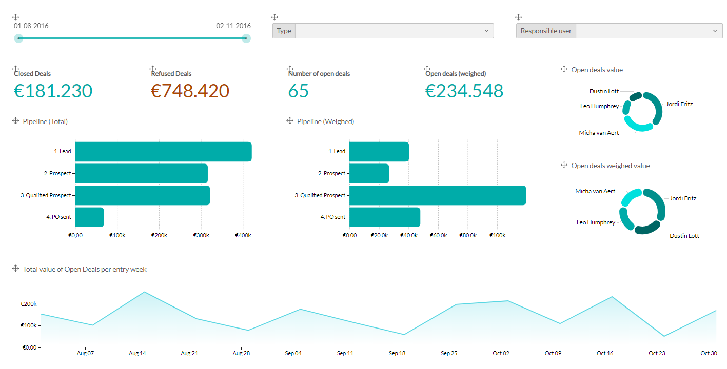
Enhancing Dashboard's Looks: Color and Visual Emphasis Techniques
Maintain a Consistent Color Theme
1. Uniform Color Palette:
Use the same color scheme throughout the dashboard for similar data to ensure visual consistency.
2. Avoid Drastic Changes:
Refrain from switching colors drastically between different sections or charts, as this can confuse users and disrupt the visual flow.
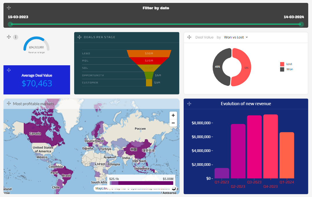
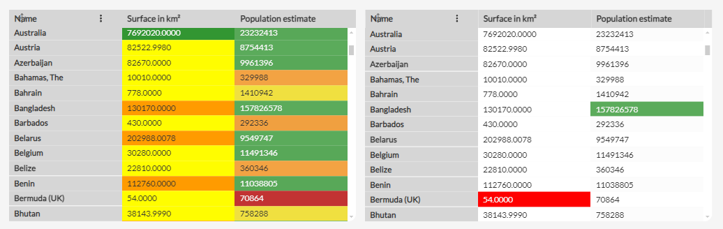
Highlight Key Information
1. Strategic Use of Color:
Apply contrasting colors (e.g., green for positive metrics, red for negative ones) to draw attention to critical data points.
2. Limit Color Use:
Avoid using too many shades or overly bright colors. Use bright colors sparingly to emphasize important information without overwhelming users.
Provide Context: Clear Titles and Labels
1. Add Annotations with our Info tooltip:
Include explanations or insights near relevant data to provide context. For example, explain why a particular metric is important or what a trend signifies.
2. Readable Fonts and Sizes:
Use appropriate fonts and sizes to make context and insights easily readable and distinct from other elements.
3. Descriptive Titles:
Ensure each chart and visual element has a clear, descriptive title that reflects its content. For example, use titles like “Q1 Sales Performance” for a sales chart.