Aggregations
In Luzmo, there is a high range of possible building blocks to create your perfect dashboard. You can use your data in many different ways and tell the same story in multiple forms. In that same way, there are multiple options to group and present your measured data, called aggregations.
By changing the aggregation of the Measure slot, the data will be grouped and calculated in a different way. This results in a different outcome for the same numbers. Numeric data has more aggregations than hierarchical data and can be changed in all charts. Let’s take a closer look!
Aggregations overview
The data in the Measure slot has the following aggregation options: sum, average, median, count rows, count distinct, minimum, maximum, standard deviation and rate. The aggregation of the Measure slot is by default set to sum by default for numeric columns and to count for hierarchy and datetime columns. It can be changed in the data menu of the object.
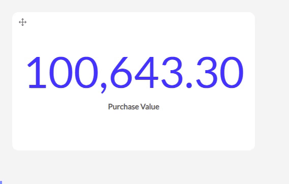
Sum
The sum aggregation sums up all the values of your column. The measure displayed by the chart will be this sum.
Cumulative Sum
The bar, column, line & area charts support the cumulative sum. Cumulative sums are mostly used to display the sum of a measure over time. For each period, it will sum the currents' period value with the previous total giving you the progression of the sum over time. It essentialy shows the sum of the measure incorporating all data up to the period.
Average
The average aggregation will take the average of the sum of the values, which will be displayed as the measure in your chart. Additionally you can select a weight column which will then result in a weighted average!
Median
The median aggregation will take the median value of the numbers in your measurement column. The measure displayed by the chart will be this calculated median.
Count Rows
The count rows aggregation counts the number of rows (including nulls) and will display this number as your measurement.
Note that via our API data get endpoint and aggregation formulas you can also retrieve the count of a specific column, which will count non-empty values only.
Count Distinct
The count distinct aggregation will count how many unique values there are in your column. Each unique value will be counted once, independently from how many times that value occurs in the column. The measure displayed by the chart will be this number of unique values.
Minimum
The minimum aggregation takes the smallest value found in the column and will show this as measurement in your chart.
Maximum
The maximum aggregation takes the highest value found in the column. The measure displayed by the chart will be this highest number.
Standard deviation
The standard deviation aggregation calculates the standard deviation of the numbers in your column and will show this as the measure.
Rate
The rate aggregation gives you the option to divide the sum of the values of your measure column by the sum of the values of another numeric column. The possible columns to use as the denominator will be given via a drop down menu. The rate of these two columns will be taken as the measurement in the chart.
These different aggregations can be used for the data of the Measure slot for every chart containing this data slot.