Preparing your data for analytics: an example
A common pain point for anyone who needs a layer of analytics and visualizations for the data they’ve accumulated, is often getting that data ready to be used. In this article we highlight some Luzmo functionalities which can help you get your data in an easy-to-use and performant data model ready for your business analyst or even clients to create dashboards with them.
Why?
Creating a performant data model before adding your visualization layer allows you to make sure you model is built in such a way that it is:
- Reusable and easy for your designers to implement dashboards and visualizations with
- Decoupled from your analytics and visualizations layer. Ultimately, this reduces the complexity for your designers. By decoupling complex JOINs, data cleaning steps from within your data visualization tool, your designers can make sure they focus on building dashboards
- Performant to your specific dashboard needs
- Lastly and possibly most importantly, a single source of truth for your data would allow you to ensure consistency by avoiding error prone duplicates.
Ultimately, when there’s a need for an analytics/visualization layer, you most probably already have the data you want to analyze somewhere. Before you start creating dashboards using this data, a good idea is to start thinking about how that data might need to be re-modelled to achieve the insights you require. This is not an easy step. In most cases, it requires a deeper technical understanding of the existent data, and an idea of how it should be re-modelled to meet the requirements.
How?
In this article we will show you how to:
- Create a denormalized data schema in Luzmo using the SQL datasets functionality
- Translate database values to business relevant values using the Hierarchy editor
- Add additional business logic to values displayed by creating a derived column or using the SQL datasets functionality
- Relate tables in Luzmo so they can be used together in a dashboard using the linking functionality
The data
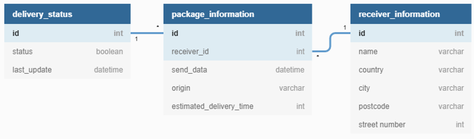
The example data is from a logistics company which is into deliveries. They have information on the packages being sent, the status of each package and the receipients of these packages. This information is stored in separate tables:
Receiver information
| id | name | country | city | street number | postcode |
| … | … | … | … | … | … |
| 41 | “Una” | “Indonesia” | “Bokong Timur” | 9222 | “” |
| 42 | “Aila” | “Portugal” | “Bicesse” | 94686 | “2645-168” |
| 43 | “Amil” | “Kazakhstan” | “Ognevka” | 439 | “” |
| … | … | … | … | … | … |
Package information
| id | receiver_id | send_date | origin | estimated_delivery_time(days) |
| 1 | 67 | 12/28/2020 | “Indonesia” | 6 |
| 2 | 41 | 12/8/2020 | “China” | 10 |
| 3 | 49 | 11/20/2020 | “China” | 15 |
| 4 | 52 | 12/5/2020 | “Vietnam” | 10 |
| 5 | 27 | 12/19/2020 | “Kosovo” | 2 |
| .. | … | … | … | … |
Delivery status information
| id | status | last_update |
| 1 | false | 01/18/2021 |
| 2 | false | 01/12/2021 |
| 3 | true | 12/30/2020 |
| 4 | false | 01/30/2021 |
| 5 | false | 12/21/2020 |
| .. | … | … |
Relation between the tables
Some fields relate to each other accross the different tables. For example, the id fields in the Package Status and Package Information tables, and the receiver_id field in Package Information and id in Receiver Information. These relations will be used in step one when we denormalize the data.
Connect the data in Luzmo
The three tables as laid out above are inside a PostgreSQL database. The first step will be to connect to the PostgreSQL database in Luzmo. Luzmo supports a variety of different data sources. You can find instructions on how to connect your data from most of these sources here.
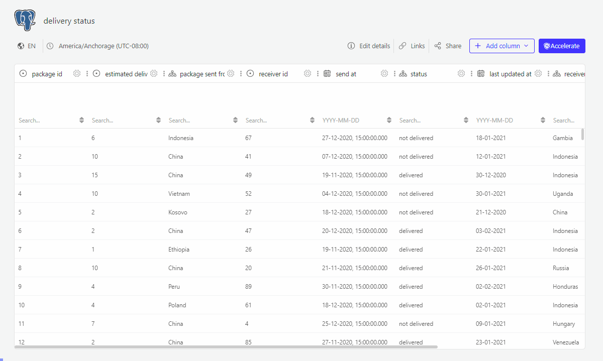
1. Create a denormalized data schema in Luzmo using the SQL datasets functionality
Instead of connecting the separate tables, we are going to create an SQL dataset which creates a denormalized view of the data:
- joining the dimension tables into the fact table
- selecting only the attributes which will be used within the dashboard
- renaming columns to labels which should be used within the dashboard
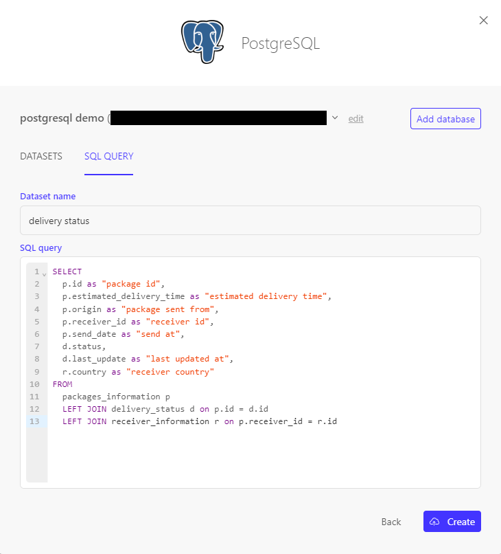
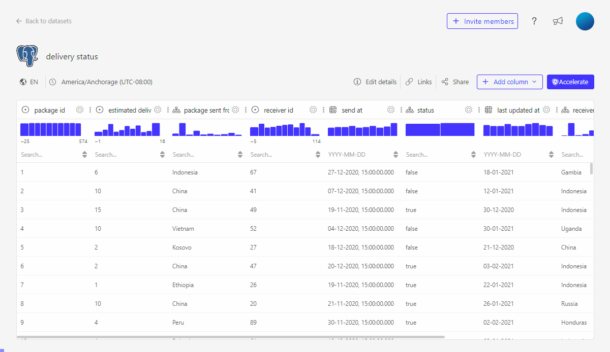
This gives us following table:

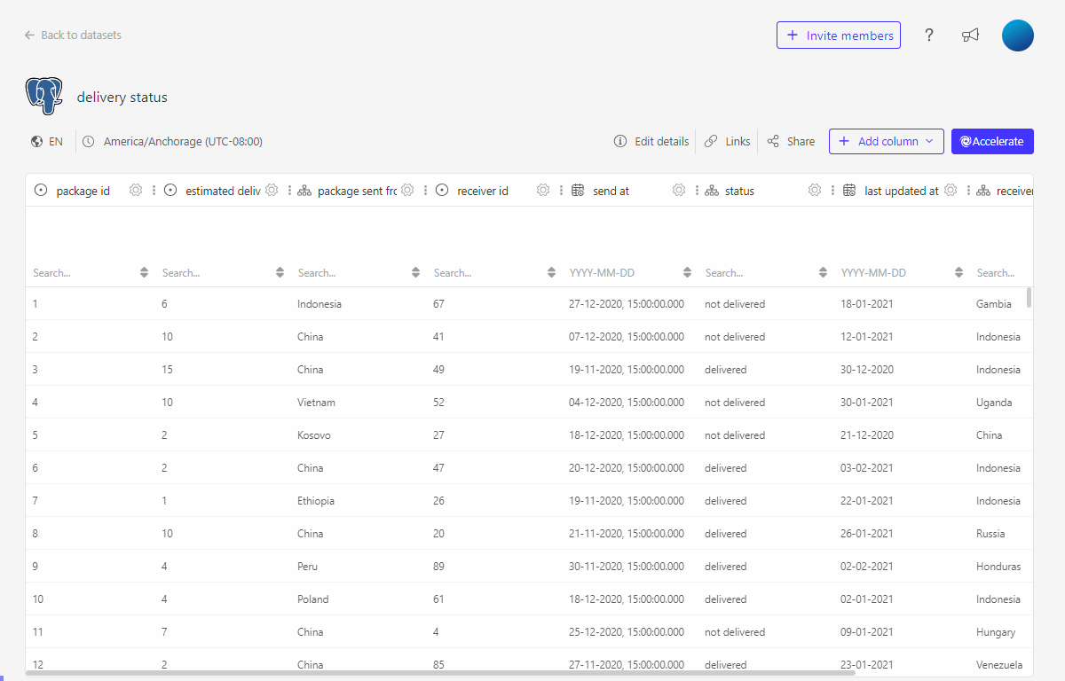
2. Translate database values to business relevant values using the Hierarchy editor
On our dashboard we will not want to display status true or false but rather status delivered or not delivered.
We can either include this change inside the SQL query in e.g. a CASE statement, but we can also make use if the hierarchy editor to "translate" the database value to a business relevant value.
3. Add additional business logic to values displayed by creating a derived column or using the SQL datasets functionality
Next to having the information whether a package is delivered or not, we would also like to know if a package was delivered on time. This extra information can be added to the data set by adding some simple business logic. Here as well, you can either add this in the SQL query by using e.g. a CASE statement (recommended approach as this will ensure the calculcations are done by your database) or by creating a dervied column in Luzmo.
3.1 Add another column using a CASE statement in the SQL query (recommended)
We can easily extend the SQL query we already have to include another column using custom business logic.
3.2 Using the formula editor to create a derived column
We can also create this same column using the formula editor.
4. Relate tables in Luzmo so they can be used together in a dashboard using the linking functionality
We have information on the receiver country inside our dataset. However, to be able to use this on a map visualisation we need topograpy or coordinates information. Among the Public datasets in Luzmo there is the World Countries dataset which encompases this information for each country in the world. If we link our delivery status dataset with the World Countries dataset, we will be able to use them together in the dashboard.
The result: a dataset ready for dashboarding
The dataset is now ready to create dashboards with it. The dashboard designers, be it your business analyst, customer success managers, ... or even your clients, do not need to be data experts or even be aware of your underlying data model. The created data model is not only easy to use but will also garantuee performant querying and serve as a single source of truth for all your dashboards.
To recap, we:
- Created a denormalized data schema in Luzmo using the SQL datasets functionality
- Translated database values to business relevant values using the Hierarchy editor
- Added additional business logic to values displayed by creating a derived column or using the SQL datasets functionality
- Related tables in Luzmo so they can be used together in a dashboard using the linking functionality
Check out this dashboard which was based on our dataset: