Using CSS to create pixel perfect dashboards
CSS is a powerful tool for customizing the appearance of your dashboards and widgets. In this article, we'll explore some common uses for CSS and provide examples of the code you can use to achieve these effects.
In this article we cover:
- How to inject CSS in a dashboard
- How to target a specific Dashboard Item
- How to target a specific Type of Dashboard Item
- Some examples
How to inject CSS in a dashboard
There are two ways to inject css in your dashboard.
Dynamically inject CSS
You can dynamically inject CSS in the Embed Authorization request, which might be interesting in case your CSS e.g. needs to be applied on all dashboards, or the CSS to be applied is different per user. This Academy article provides more information about this feature!
Statically inject CSS
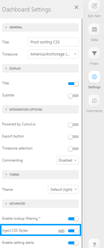
At the end of the dashboard settings under 'Advanced', you can enable the 'Inject CSS Styles' toggle. In the popup modal, you can now add any CSS you'd required to achieve your pixel-perfect dashboards!
Targeting a specific Dashboard Item
You can target a single dashboard item with CSS by specifying its unique ID using the following syntax:
#w<item-id> <other CSS Selector(s)> {
  // your CSS declaration(s) here
}
Replace <item-id> with the actual ID of the dashboard item you want to target. You can find this ID at the bottom of the specific item's settings side menu. This will ensure that the CSS styles are only applied to the item with the specified ID, and not to other dashboard items.
Targeting a specific Type of Dashboard Item
You can target a specific type of dashboard item using CSS by specifying its class. To target a dashboard item with a specific class, you can use the following syntax:
.element-to-target {
  // your CSS styles here
}
Replace element-to-target with the actual class of the dashboard item you want to target. This will ensure that the CSS styles are only applied to the item with the specified class, and not to other dashboard items.
In the video below, you can see the steps that you need to take to identify and target the space to the left of the title of a Pivot Table, after embedding a dashboard. The same process can be used to identify and target almost any element.
Examples
Please see some popular examples of CSS injections below:
- Hiding the Bottom Scrollbar in a Regular Table
- Modifying the Export Icon
- Using the regular table to show a dynamic text, for example "last updated at timestamp"
- Modifying Dashboard Item messaging
- Hiding a Dashboard Item with No Data
Hiding the Bottom Scrollbar in a Regular Table
When working with table widgets, it is not uncommon to find situations where the data in the final row of the table is partially or completely hidden by the bottom scroll bar. This can be especially frustrating for users who are trying to read and interpret the data in that row.

One solution to this problem is to remove the bottom scroll bar from the table widget. The code for hiding the bottom scrollbar in a regular table is as follows:
.regular-table .ps__rail-x {
   display: none !important;
}
Example:
Modifying the Export Icon
You can modify the export drop down to only show 'export as png' by using the following code:
.widget-export-dropdown-menu .dropdown-item:not(.export-image) {
     display: none !important;
}
To remove the export button for all widgets, you can do this from the dashboard settings or use this code:
.widget-export {
    display: none !important;
}
To change the size and color of the export button, use this code:
.widget-export .export-toggle fa-icon {
     color: red !important;
    font-size: 24px !important;
}
Example
Using the regular table to show a dynamic text, for example "last updated at timestamp"
It can be helpful to build a widget that shows the date and time that your data or dashboard was last updated at. By displaying the last update time on the dashboard, users can have confidence in the accuracy of the data they are viewing. This can be especially important in fast-paced environments where decisions need to be made quickly.
To create a widget that shows the last update time, a table widget can be used. To make the widget look cleaner and remove the sorting function, the header of the table can be removed. Additional we will remove the "showing limited observation" indicator.
To create the table widget in the example we added a single date column and sorted the table by the date column in descending order. Additionally, we set "Show Number of Records" to 1 in the table's settings under "Advanced" (turn off "infinite scrolling" to enable the show number of records" setting).
Hide the limit number of observations flag and remove the table header by using the following code:
.viz-object-info {
   display: none !important;
}

.regular-table .regular-table-headers {
   display: none !important;
}
Example
Modifying dashboard item messaging
When interacting with dashboards, you may come across situations where you need to customize the messages displayed by certain dashboard items. This allows you to provide more specific and friendly information to your users. In addition, you may also want to customize the styling of these messages to match the visual identity of your application. This section will guide you through modifying the messages and customizing their styling.
We provide default messages for various scenarios, such as "No Data", "Query Failed", "No Access", and more. To modify these messages, you can target their specific classes in the CSS code. Here are some examples of messages and their corresponding classes:
- No Data:
.description.no-data - Query Failed:
.description.query-failed - No Access:
.description.no-access - No Column Access:
.description.no-column-access - Dataset Not Found:
.description.dataset-not-found - Rate Limit Exceeded:
.description.rate-limit-exceeded - Too Many Requests:
.description.too-many - Query Engine Version Not Supported:
.description.qe-version-not-supported
To change the text of the no-data message, you can use the following code as a reference:
.popup-message > .description.no-data::after {
    content: 'Sample new message';
}

.popup-message > .description.no-data span {
    display: none;
}
Example
In addition to modifying the message text, you may also want to customize the styling of these messages to align with your application's visual design. For example, you can change the background color and text color of the "No Data" message. Here's an example of how to achieve this:
.popup-message > .description.no-data {
    background-color: red !important;
    color: green !important;
}
By applying the above CSS code, you can customize the background color to red and the text color to green for the "No Data" error message.
Hiding a Dashboard Item with No Data
In some cases, it may be more appropriate to hide the widget with no data. This approach can help to reduce clutter and confusion in the application. Note that this only hides the dashboard item, it does not reposition other dashboard items within that dashboard.
To hide a widget with “No data”, use this code:
.description.no-data{
    display: none !important;
}

.popup-message{
    // The hex color code here should be equal to the dashboard background color!
    background: #f2f2f2 !important;
}

.widget-wrapper.with-title .popup-message{
    top: 0 !important;
}
In conclusion, CSS is a powerful tool that can be used to customize the appearance of your dashboards and widgets. By using the code examples provided in this article, you can achieve a wide range of effects, from hiding scrollbars to modifying the text of a “No data” message. Happy customizing!