Pivot table
Pivot tables are perfect charts for summarizing your data, grouping by catagories and displaying aggregated calculations. It allows you to transform columns into rows and the other way around.
In this article we cover:
- Columns, Rows, and Measures slots
- Expand and Collapse
- Expand style
- Sticky Header Columns
- Sorting a pivot table
- Conditional formatting
- Layout edits
- Word Wrap
- Grand totals
- Variable period comparison
- Limits
How to create a Pivot table
PIvot tables are located underneath the ‘general’ section.
By clicking on the ‘data’ settings, you can see that pivot tables visualize three dataslots: columns, rows and measures.
Columns
Columns with data types ‘hierarchy’ and ‘date time’ are a perfect fit for this dataslot.
For each value in your added column, a column appears in the Pivot table. You can add multiple columns to this slot, which will be displayed as a waterfall. The column added first will function as the highest level. You can easily switch the levels in the data settings of the chart, as you can see in the illustration below.
The numbers displayed in the white area are the number of rows for each value in your dataset, since we have not yet added a measure. In the example below we see the number of rows per month.
Rows
Columns with data types ‘hierarchy’ and ‘date time’ are a perfect fit for this dataslot.
Next to adding columns to the column slot, you can also add columns to the row slot. This will result in having multiple rows which gives the typical looks of a Pivot table.
You can as well add multiple columns to this slot and easily change the levels in the data settings.
The numbers in the white area are still the number of rows for these values in your dataset. In the example below we see the number of rows per Customer name category, split up by Product name.
Measures
Columns with data type ‘numeric’ are a perfect fit for this slot.
By adding data to the measure slot, you create enhanced and multidimensional insights in your data.
When adding more than one column to the measure slot, extra columns will be created on top which might become complicated. Make sure your Pivot table stays easy to read.
By default, the sum aggregation is activated. You can change this to e.g. average in the settings of the measure slot. Want to learn more about the different aggregations? Check out this article.
In the example below we see the Amount spent per Customer name category, split up by Product name.
Configuring a Pivot table
Expand and Collapse
The “Interactivity” section of Pivot Table options has the “Expand/Collapse” option this is turned ON by default for new tables and can be turned turned OFF via the toggle.
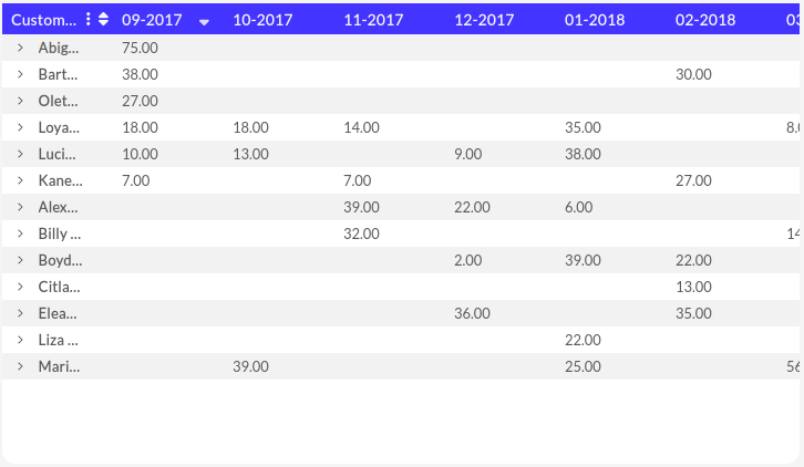
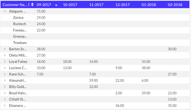
With this feature turned ON you are able to expand or collapse the categories of the pivot table to get a different view of the data. In the dashboard below you can see the monthly total of sales for each customer. Expanding on the Customer Name and now you can see the amount of sales of each product from that customer for the month.
It is also possible to save the current expansion state. This makes it so the table will be initialized with saved expansion when opened.
The top-left cell contains a “⋮” button which gives you options to collapse or expand ALL items on the pivot table.
Expand Style
By default, the Pivot table will present the various categories added into the Rows dataslot in an Indent format, the style of expanding between these categories can be modified in the general settings of the pivot table to change from indented categories to having a column for each category.
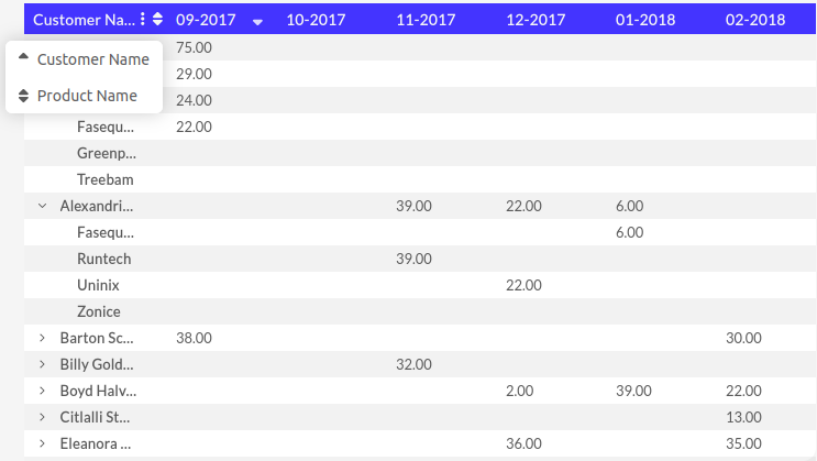
The "Indent" expand style shows a more condensed view where as the "Columns" expand style provides an individual column for each category. To sort by a category when using the Columns style can be done by clicking directly on the column, when using the Indent style a drop-down menu will appear when clicking on the sorting icon next to the rows' category allowing the user to select which categories to sort by.
Sticky Header Columns
By default, categories added into the Rows dataslot will be "sticky" - e.g. they will not be affected by horizontal scrolling. When the expand style is set to "Columns" these columns will be filled with the theme's "main" color to differentiate them.
If the width of these "Rows" dataslot catagory columns is wider than the chart and "sticky header columns" is enabled, measure columns cannot be displayed on the pivot table. To enable horizontal scrolling in this scenario, disable "sticky header columns" toggle in the pivot table settings under the Headers section.
Sorting
After adding your data, you can change the way of sorting by clicking on the titles of the columns and rows. The little arrows indicate whether the values are sorted ascending or descending.
In the settings of the chart, you can always reset all the sortings you executed.
Understanding how sorting on a pivot table works is essential for effectively organizing and analyzing data within your pivot tables. So let's dive in and discover how this works in a pivot table.
The sorting in pivot tables ensures that previously sorted columns or rows retain their order when applying subsequent sorting to the measures criteria. To better illustrate this concept, let's consider an example using the customer names and associated product amounts in the above chart.
When you sort on a measure: the categories will be sorted within each level. Suppose you initially sort the above pivot table by amount for the date 9-2017 in ascending order. This arrangement allows you to quickly identify what customer had the most sales during that period.
The data in the column 9-2017 is sorted based on the measure, meaning that the customer name and product name are sorted based on the measure within the 9-2017 date.
Expanding the data shows that the products are sorted within each level so it is easy to identify what product sold the most during that period for the expanded customer.
If you now sort on the category customer name, that category will be sorted alphabetically, while any other lower or higher category will still be sorted based on the measure (always within their upper level categories). It's as if each customer is treated as a separate bin that is isolated from the others, and within each bin, the product names are sorted based on the amount sold.
Sorting a pivot table provides a powerful way to sort and analyze data, allowing you to maintain the integrity of previous sorting criteria while applying new sorting rules. By understanding how this sorting works, you can effectively organize and explore your data, uncovering meaningful insights and patterns.
Remember, when sorting a pivot table, changes to the sorting of category will be respected when sorting the measure. This sorting approach ensures that you can analyze and interpret your data accurately, while still benefiting from the flexibility of sorting options.
Conditional formatting
Do you want to see how your values are doing at a glance? Then using conditional formatting is exactly what you need. By activating different color-scales, you can easily see which parts are doing great and which are not.
There are different styling possibilities and you can choose between different color schemes or create your own.
Layout edits
The Pivot table can be customized the way you desire. Colors, alignments and the type of table borders can be changed.
Word Wrap
Sometimes the data added to your pivot table will contain text that is too long to fully display within the bounds of a column. This is where word wrap comes in handy!
Word wrap can be found in the setting of the Pivot Table object under the Headers dropdown. This feature can be turned on/off with a simple click of the switch marked Wrap Text.
Enabling word wrap will cause the chart to automatically transfer any word for which there is insufficient space from the end of one line to the beginning of the next. As seen below:
This feature can be very handy for data that contains titles or descriptions with multiple words and enables your viewers to have a quick and easy view of the data.
Grand totals
You can easily activate to show grand totals at the right and at the bottom in the data settings of your rows and columns. With the default expand style of Indent only the first row category can have grand totals enabled, in order to enable grand totals on subsequent row categories, the expand style must be set to "columns" first.
How average grand total is calculated
Let's also get into more detail about how the average with a grand total is calculated. Consider the small 'Sales' dataset below as an example.
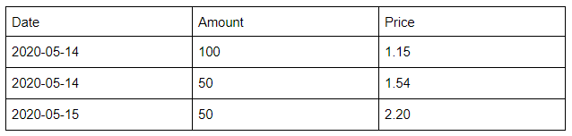
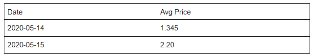
The 'grand average' over the 3 transactions is 1.63. This is not equal to the average of the 2 days separately, which would be 1.7725, as May 14th has more transactions overall.
A weighted average would also take into account the amount, for example. In that case, May 14th would weigh for amount 150/200 = 3/4 in the average instead of 2/3. There's currently no way to only weigh May 14th for 1/2 here, which would be the "average of average prices per day".
You can now try it yourself: perform this magic trick on your own pivot table! Let us know by mail if you need an extra hand from our wizards. We're happy to help!
Variable period comparison
Pivot tables now support variable period comparisons (currently in beta). You can compare data across two modes:
- user-defined, where you use the Date comparison filter to select specific date ranges
- relative, which automatically compares against the previous period.
For each mode, you can display the past value, the absolute change, or the percentage change — the same options available in other chart types.
Please see the video below as an example of how to set up the functionality in both modes. As this feature is in beta, please let us know at support@luzmo.com if you encounter any issues.
Limits in pivot table
In a pivot table's Settings, you can find three limit options under the "Advanced" collapsible at the bottom. These are evaluated as follows:
- Show number of records: this number is limiting the multiplication of (collapsed) "Rows" times "Columns" values (i.e. the values of the columns used in these two slots). This does not limit the number of "Measures" columns.
- Limit columns: this is only limiting the number of (collapsed) "Columns" values.
- Limit rows: this is affecting the number of (collapsed) "Rows" values.