Parallel coordinates plot
If you have data that you would like to analylize based on multiple variables and potentially discover some dependencies - parallel coordinates plot would work perfectly for it!
Parallel coordinates plot
This chart is commonly used to represent multivariable data in a clear way!
Each variable gets it’s own axis where data points are plotted. Data points are then connected with lines as such it’s easy to read the graph and discover trends or dependencies.
Let’s build parallel coordinates plot together!
How to create it
Parallel coordinates plot can be found underneath the ‘Special charts’ section. By drag & dropping it onto canvas, data can be added to the two dataslots ‘Coordinates’ and ‘Color’.
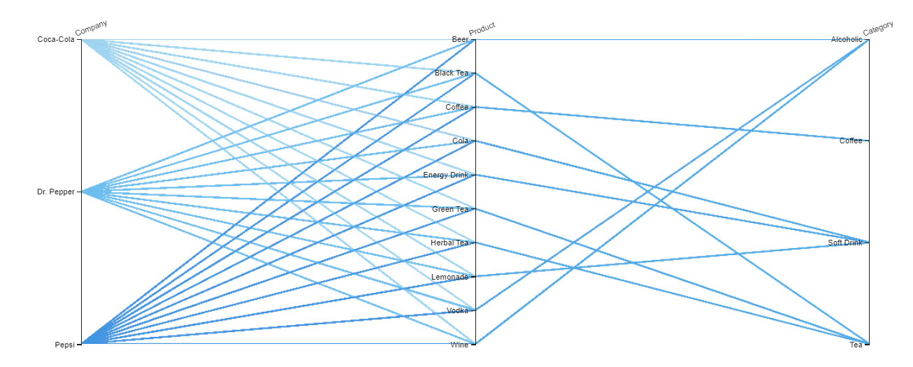
We will build a parallel coordinates plot to visualize Drink Sales and some of their stats!
Coordinates
Columns with data types ‘hierarchy’ and ‘numeric’ would perfectly for this slot.
The data added to this slot defines how many parallel axes your chart will have. On the example below we add Company, Product, Category to this slot.
Color
Columns with data types ‘hierarchy’ would work best for this slot.
This slot works similar to group by feature. When adding data to it, lines from the same group will appear in the same color. As such you can track and trace trends by group.
In our example we are using Company in a color slot.
Tips and tricks
As mentioned parallel coordinates plot is perfect for multivariable filtering and data exploration. You can easily filter on one or multiple axes.
In the chart settings you can enable or disable an option to show all axes.